It’s taken me forever to answer this and I’m so sorry but here’s a quickly garbled nonsense post about expressions!!
Although to start here’s a couple of links to far more helpful tutorials here and here.
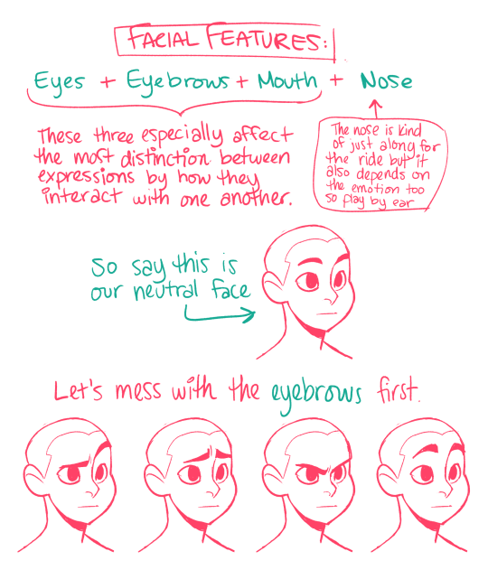
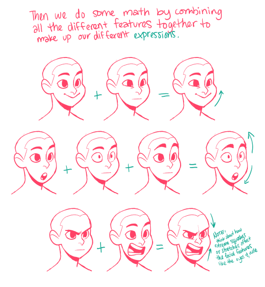
There was also this awesome chart that I’m having a hard time trying to find. I thought I had tagged it, but apparently I can’t remember the correct tags for it so I’m just gonna rehash what it was essentially about separating the features and adding them with each other to get the emotion you want?? god I wish I could find the original thing but um here’s my quick version
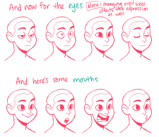
I feel like there’s so much I’m skimping on but I guess I should point out that the reason why I’m pointing out the entire expression is because each of the features of the expression helps contribute to the eyes feeling more expressive.
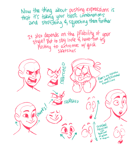
Just the slightest adjustments can really affect the overall attitude and effect of an expression. I highly recommend studying how other people draw expressions AS WELL as drawing from your own face.
Have fun with it and play around as much as possible! <33
I’m reblogging this for two reasons:
1. @madidrawsthings is amazing and her work should be seen by all.
2. I was asked forever ago to do a tutorial on how I draw facial expressions and I totally never made one, though I meant to, because when I sat down to create one I realized how complicated it was – but she made it super clear! Not only that, she has a VERY similar approach to mine, especially her focus in these drawings on the stretch and compression of the face over all. Seriously, I love this!
So I hope looking at her awesome stuff helps anyone who’s curious how I draw facial expressions.
i don’t really have any specific reference places but here’s some things i do.
drawing birds is arguably one of the hardest animals because of their feathers. unlike fat and fur that folds to the body in a way that’s usually readable to whats underneath, feathers sort of create a ‘bubble’ around the body which makes a lot of body parts indistinguishable to where one ends and another begins. so its important to always think in terms of skeletal anatomy:
birds are dinosaurs and therefore reptiles. looking at birds this way, it’s a lot easier to see their evolution.
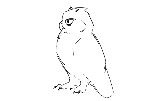
with that in mind, say we wanna draw this dude. owls are pretty tough because their outward appearances are so deceiving.
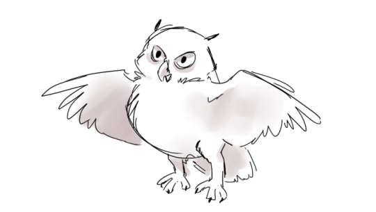
we’ve got a neutral pose, feathers are generously surrounding most of the body so its no sweat, we don’t really know whats going on. but we can hide it. but now we want to make him move and look cool. without really knowing whats going on we might get stuck on something like this:
its always kind of stiff and frustratingly unrealistic. mostly this is because we just don’t have enough knowledge of the skeletal structure to work with. eyeballing anatomy on our first drawing might get something like the left, more than anything people aren’t generous enough with leginess of birds:
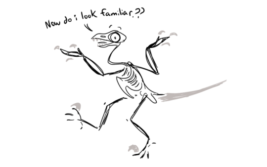
owls do indeed have regular proportioned necks with the rest of their bodies. and their skulls are like that of any other stereotypical raptor under their mask of feathers (minus their freaky eye sockets and ears)) they can open their mouths wide just like a hawk or eagle can. it’s important to remember that birds with large wingspans do not magically lose their length when hidden. they are just conveniently folded in against their bodies.
knowing this we can try again. suddenly things seem to click in place more and have a believable-ness to them.
the rule of thumb for most birds is they have less body mass and more leg/neck than one thinks. they are lanky dinosaurs.
when we are looking at this:
we are seeing this:
with that rule, drawing birds becomes a lot less confusing. with practice you might just eyeball their feathered appearances but if not, going back to skeletal/muscle structure gives the base you need to draw convincing birds.
when it comes to specific body parts, the most challenging part for me personally have always been feet. birds with super twiggy feet are easier because one line per toe is easy to get away with. but when you get to birds with meatier feet, especially raptors, it gets difficult. my way of getting around this is to think of the actual ‘feet’ last. drawing each separate toe first gets confusing because you just find yourself trying to get them to each fit evenly together at the base of the foot. one always seems kind of skinnier or fatter than the others in my experiences, and by the time you correct it the gesture gets muddled and lost.
so i just skip that part until later, i draw talon first.
perhaps this is very unorthodox, but just like artists might square in the hands first on a human before working out the arms, i square in the talons to know where i want them before worrying how they go on exactly.
that way we have a clear gesture captured, and in my experience it is much more readable.
thats’ really all i can think of now in terms of my techniques, i hope this helps :V
I’ll be showing how to make simple HUD (heads-up display) circles (aka futuristic circle things) in After Effects (and without using keyframes) like these:
This tutorial is designed for people with little experience with After Effects, so theres a lot of extra explanations
Click “Keep reading” below to view the tutorial because looonngg post
Hellooo! Aaaa thanks so much!!! Oh gosh! I’m known to be TRULY wild with my color choice so I’m unsure if I’m qualified..! But, regardless, I’d love to help!
To start, there’s no harm in using references for colors, similarly with how you’d use reference for drawing poses, backgrounds, clothing, etc. Here are some sites:
colourlovers – this is my favorite one! Sometimes I’ll search a random word (like “happy,” “friends,” “sunshine,” “sadness”) and pick what I think would fit the mood of my piece. A lot of times I’ll end up editing the colors to fit more what I want, adding a color that complements the rest, or adjusting the values of the colors so my piece will be more balanced. But overall it gives you great ideas and can be a fun exercise to limit yourself with their palettes 💖
pictaculous – upload a photo/pic you like and get a limited color scheme for it!
(anyone please feel free to link other resources in the comments!)
If you’re struggling more with technicalities, I have some tips, too 😁:
1) Don’t rely on local color
This is sort of funny but I didn’t even know what the term “local color” meant until, like, my 3rd year of college? LOL anyway, there’s no reason to use real colors ever! Instead of making your color scheme work around your subject, try stylizing your color choice! Settle on a color scheme and substitute the local color with one that might be similar (or just go wild). For example:
red sand might remind you of brown sand
purple sidewalk might remind you of grey sidewalks (or maybe just sidewalks with a nighttime feeling?)
Landon’s hair is pink instead of red + a pink cactus because I’m Wild
2) Limit your color scheme
It may or may not be obvious that I love to use as few colors as possible… LOL. Doing this is super exciting IMO, because you literally only choose the colors you like!!! DOWN WITH BROWN! I don’t ike brown………… except to eat chocolate
1st img, I used the same red for hair + shirt, the same orange in the jacket details + shoes, and for the jacket + pants I used the same grey but used the color slider and made the pants lighter
2nd img, I used a formula where there’s pink hair/shirt/shorts/shoes (note: that kid is a brunette but I made him have pink hair) + grey hair/shirt/pants/shoes + purple accessories…………….. do you see it, like a zig-zag? Fun, right? 😁
3rd img is where I most obviously used limited colors. I’m sure not every furniture in a house will be blue/purple/green but those are the colors I chose when I started so I just used them! You can do the same with clothing. Nothing has to be real 🎉 WE’RE WILD AND FREE 🎉
3A) Try not to use black or grey
I mean, if it’s part of your color scheme, go for it! But black and 100% grey are pretty heavy and don’t always add to color schemes, especially if you’re trying to be more stylized with them.
in the first 2 examples, all the outfits (including the cat bag) are supposed to be all black–but I used shades of purple instead.
3rd img, rather than using just straight up grey, I gave it a more purple-leaning (RGB color code R: 188, G: 169, B: 188)
3B) DON’T LIMIT YOURSELF WITH BLACK LINEART!
Changing the lineart color makes suuuuch a huge difference. I very rarely use black lines in my colored pieces! I go back-and-forth using a lineart color that:
contrasts most of the colors of the piece ➡️ like using a blue line when most of the colors are oranges/yellows or
complements them ➡️ like using a dark purple line in a piece that’s many shades of purples/blues
4) Experiment with overlays
Yeah……… LOLOL.
Add a layer on top of your colors/lines ➡️ fill a color (purple? pink? blue?) ➡️ set the layer style to overlay, screen, color burn, soft light, whatever, anything you like! ➡️ lower the opacity (so it’s not super wild, if you want)! Sometimes this will balances the piece out by having the colors all lean towards the one color you filled the layer with.
Don’t be afraid to use fill/adjustment layers in Photoshop and play around with the color balance!
5) Think about and plan your colors
Maybe try thinking about what colors mean? Very basically, as an example:
warm colors, yellows, oranges = feels happier
cool colors, blues, purples = sadder, more somber
like, if your goth kid is sad, maybe you’d use cooler and darker tones
maybe your character is super angry so you’ll use a violent, loud shade of red
I say this but all my works are rainbow, so…… LOLOL 😂
Anyway, those are my ideas! I’m not very fancy… //// in fact, I don’t even like to color LOLOL but those are the sorts of things I go with! If you have more questions, feel free to ask. 😚 Most of all, HAVE FUN! Best wishes!!! 💖💖💖
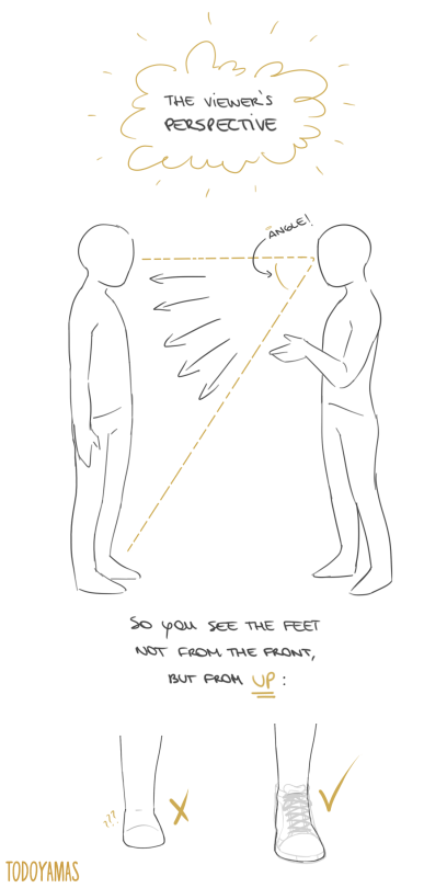
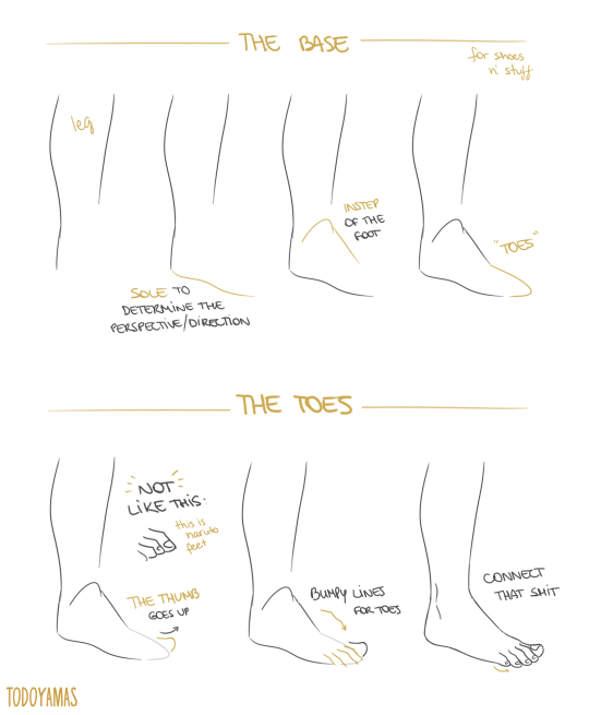
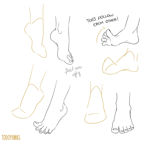
thank you a lot anon!! ( /)w() here, i made a few notes about the steps i follow while drawing feet:
^ that’s assuming you’re not drawing from a low perspective, as if the camera was on the floor or something like that!
SORRY MY HANDWRITING SUCKS and i’m not really good at explaining things bc i don’t really follow a guide and stuff so yeah BUT I HOPE IT WAS HELPFUL TO YOU!!
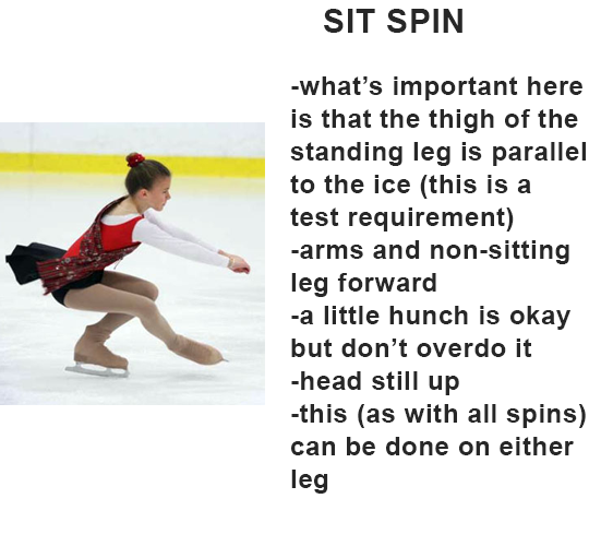
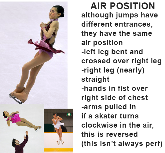
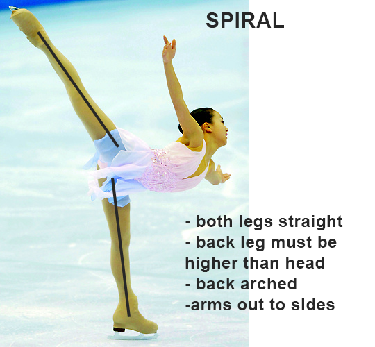
these are all the most basic versions of these positions of course. there’s a lot of different types of spirals and sit spins. some other notes i didn’t add:
on ALL spirals, the standing leg is always straight. if it’s bent, they’re doing something else/fucking up a spiral.
air positions get tighter the more revolutions the jump is. some single jumps (like waltz jumps) don’t even really have an air position. if they do, the bottom leg is straight, but instead of crossing over the left leg, it’s just bent in front of you. the arms might be in, they might be out, idk no one cares that much about singles lmao
if they’re in a performance, they’re looking up at the audience. remember, figure skating is performed in stadiums; rather than simply looking out, a figure skater has to look up to appear to be addressing their audience. they’re probably just doing it for show and focusing on their program, but the motion is still there.
if you’re in practice, however, you’re probably looking up at the skaters around you to make sure you don’t fucking crash into everyone on the ice surface. self-explanatory.
your face will literally never look good mid-jump or spin.
not technically figure skating, but pairs have more jumps and higher lifts than ice dance. there’s a specific rule regarding this, but since i never did either, i don’t know it.
this definitely wasn’t a vague at the yuri on ice fandom. okay, it was, but i’m mostly excited that so many people are paying attention to figure skating now, so y’all are chill.
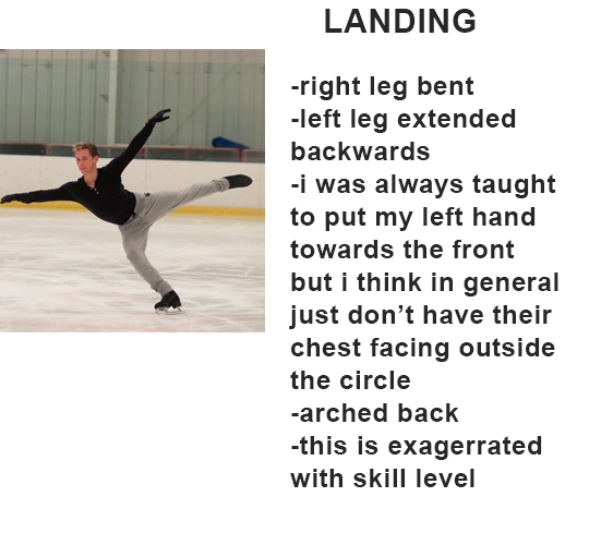
just remember: head up, arched back, extended leg is probably straight. draw with motion. if you don’t know what a position’s supposed to look like, don’t just look at references; you can even google the test requirements for a specific jump/spin/move if you want to. (ISI is a good place to start, since they’re international and everyone uses pretty much the same criteria for individual moves anyways.)