Cropping can be tricky. I use a very simple trick of cropping things at 2/3 or ¾. I avoid cropping at any joint or edge to avoid the illusion of something is missing or uncomfortable.
This
tutorial is about acting for comics! It’s not a subject people talk about a lot, at least compared to art and writing, but I’d argue that great character acting is one of the reasons we fall in love with fictional characters… and horrible character acting is why we stop believing in the characters, the story, and possibly the creator?? Fortunately, learning to spot bad acting is an easy way to correct it in your own work.
I was maybe a little snarkier in this tut than I needed to, but we’re friends here, I don’t need to pretend with you that I love every work equally. What I really do love tho, is when people learn to turn their criticism into corrections, which is the whole point of making and sharing these tuts! I hope you enjoy it :] You
can also check out a bunch of human, monster, and alien crab acting in my own
comics The Meek and Mare Internum.
All of my tutorials are released in lower-res format to the public 6 months after
publication at the Shingworks Patreon. You can access the full tutorial archive, as well as nearly 1.5
years worth of bonus content, by becoming a Patron :] The recent tutorial is about Worldbuilding, so feel free to stop by~
and! thanks a ton in advance for not removing my text ❤
This is great!!
One of the big tells for me that a cartoonist is a novice is when they rely too heavily on manga/anime exaggerated expressions – we see this A LOT with first-time webcomics. Even if you love manga and want to create works with that visual language, notice how those exaggerated expressions are most effectively used to enhance a moment. They aren’t there to handle the bulk of the acting or to carry a scene. If you use them constantly for every expression, it becomes visually exhausting (and reads disingenuous), and also you have nowhere left to go if you want to use a goofy expression as a visual punch.
Anywho, I back Der-shing on patreon and she always has good and insightful tips from a valid perspective with lots of experience!
(Eventually I want to back all the women in webcomics on patreon, but… that is a story for another day.)
This tutorial contains tips about researching for comics! I use research a lot in my own work, not just for dry stuff, but to make sure I am approaching all of my subjects with sensitivity and respect. In these post-Obama times I think it’s more important than ever to be able to bring that level of deeper understanding to your life and to your work.
Additionally, I’ve mentioned it here and there, but my formal background is in science. I went to UC Berkeley, which is one of the most respected research institutions in the world. I was lucky enough to do some research of my own during my time there, and I’ve included a lot of the same methods I used in my own research here. Anyone can do good research, and I hope this tutorial helps you with your own stuff :] You can see the blend between research and fantastical situations in my comics The Meek and Mare Internum.
All of my tutorials are released in lower-res format to the public 6 months after
publication at the Shingworks Patreon. You can access the full tutorial archive, as well as nearly 1.5
years worth of bonus content, by becoming a Patron :] The next tutorial is going up soon, so feel free to stop by!
and! thanks a ton in advance for not removing my text ❤
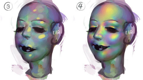
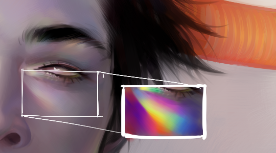
sorry im not quite sure what you mean but im assuming youre talking about the rainbow shit
i dont know all the art terms so bear with me
to add to this post, i start by just putting some random colours down then blending them out. for trolls i use lots of green blue and purple cos i guess my ocular cones n rods tell me cool colours are closer to grey than warm ones are
then i pick a colour for the high points and blend out with adjacent colours to get that rainbow effect
yellow is a good colour cos you can blend from yellow to red or yellow to blue and it will look nice + allow you to include lots of different colours which adds to the holographic/iridescent/whatever effect and still give an impression of depth without having to add heaps of black and muddying up the colours
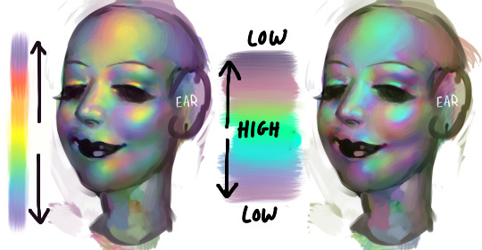
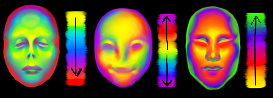
you dont have to use yellow though, i just reckon its the easiest jumping off point. below i just changed the hue in photoshop n got cyan. it still looks like its got depth and all that but now are colours are limited, we missing yellow and orange. try different shit out though. pink is nice too
these are like fairly bad pics but below are some ways to do this with yellow as the colour of your high point/bits where the most light is bouncing off
think of the arrow going from the highest to lowest points. i like doing it the way i have in the middle pic cos i reckon its a bit more fun and dynamic. but yeah dont limit yourself to yellow! plenty of other colours out there in the big wide world. and dont worry if it looks garish you can always edit it later on
anyway you dont have to think too long and hard about like colour order or anything though. the main thing is just putting the right colours next to one another, so if youve got a green patch and a red patch blend them together with some yellow, orange/red goes between yellow and purple, etc etc