Since a bunch of people have been asking here’s a rough process gif of how I made the diner panel in ctc. It’s basically how I do all my backgrounds, hope it helps
Sorry for the lack of WIPs on this pic. Here are jpg’s of all the steps (with not-so-very-clear notes).
All the work was done in GIMP.
Wait what? A grayscale shade layer??? What layer option do you use though, let alone change the color successfully?
This is a really effective way to color, actually. I do it all the time. When you make shade layer, make sure you’re ONLY shading SHADOWS and basic diffusion — NOT object/material color values (like, just because the socks should be a dark color, you’re going to completely ignore that in the shading layer.) There are two ways to mix the shading afterward. You can place the shading layer over the flats layer then set the shading to Multiply, OR put the flats over the shading and set the flats to “Color” blending. Then, you just paint some small variances in hue to whichever layer you’ve set blending mode to.
This is a great way to color because it eliminates the need to mix new colors as you pass from one flat to another. It gets less of a painterly look, but in this type of art you’re not going for that anyway. Excellent for comics.
r
SO THAT’S HOW YOU DO IT
This is very similar to how I go about coloring as well. 🙂
using this when i get home
Holy flippin’ crap I have to try this now.
This is sad to admit but I’m learning more technique from tumblr than I am from art school
hank you, im really glad you like it! I usually use SAI to draw and Adobe Photoshop Elements 2.0 (yes its absolutely ancient i knooow) to add certain effects i cant quite recreate in SAI
to get that fuzzy effect, i have the entire image on one layer and duplicate it, changing the opacity of the copy to around 30-40%
then i hide the copy for a bit, and select the background. there, i apply the “diffuse” filter found right here:
the “lighten only” mode, creates a base to get that “scanned pencil lines” look which helps to make it look more like a screencap of an older anime.
(i found that this works best with clear lines and cell shading)
then, still on the background layer, i get a gaussian blur filter going, found over here:
a radius of 1-2 pixels blurs the whole deal out a little to make it look like its a good ol low quality screencap
then i go back to the other layer and, using the same gaussian blur filter but a radius of 15-20 pixels, get that foggy feel going!
this step is the most important as it creates that dreamy, foggy feeling which helps to make it look like ye olde animes
lastly, i clean up some highlights that might’ve gotten washed away by all the blurring, and we’re done!
of course you can always do more things like add a texture to make it a little grainy, or resize the canvas to fit the average dimensions for most old animes, or do something difficult and technical with the colors which i know nothing about, but i feel like this process is a pretty alright method to satisfy those ~ a e s t h e t i c ~ cravings!
(quick before/after)
i hope this helps, im sorry this turned out so long…..feel free to ask me to clarify if anything isnt clear!
typically these should be in every photoediting/drawing program like photoshop too if u guys are unsure c:
threw together a quick little narrated video showing the Photoshop layer breakdown for my Valentina piece! It’s actually a pretty simple process when you get down to it 👌🏼
Pages 8 & 9! Will have an extra page up on friday too !
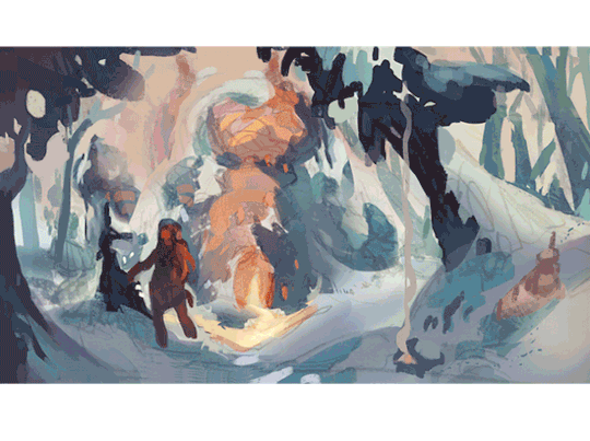
Pretty happy with this watercolor +digital spread!! Made out of an old digital concept art idea I never got around to. This spread is 2 of the 3 pages I’m posting this week – the rest of the comic is at kochab-comic.tumblr.com!!
Things My Mother Left Me, POC Destroy Fantasy I got asked to contribute to this fantasy anthology (featuring POC creators!), for this story about a witch who reclaims herself through her maternal heritage. Here is the original illustration and the sketch thumbnails. Thanks to my AD Pablo Defendini for the opportunity!
At 8:14 I completely forgot that procreation means ‘to make babies’.
— Program: Paint Tool SAI, Photoshop CS4 Canvas: 11 x 8.5 inches at 300 dpi Time taken: 3 hours to sketch, 8 hours to color. Tools used: brush tool for lineart at a low density and the pen tool at full density to color. Water tool was used for fast, uneven gradients and softer strokes. Overall process: lineart is set to color burn. If you control the pressure you can make more “transparent” strokes that you can quickly pick with right-clicking over the color. The more you do it the smoother it will blend. Lines were then painted over for a cleaner look. Overlays, multiply and color burn was used for the larger shadows.