sorry im not quite sure what you mean but im assuming youre talking about the rainbow shit
i dont know all the art terms so bear with me
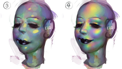
to add to this post, i start by just putting some random colours down then blending them out. for trolls i use lots of green blue and purple cos i guess my ocular cones n rods tell me cool colours are closer to grey than warm ones are
then i pick a colour for the high points and blend out with adjacent colours to get that rainbow effect
yellow is a good colour cos you can blend from yellow to red or yellow to blue and it will look nice + allow you to include lots of different colours which adds to the holographic/iridescent/whatever effect and still give an impression of depth without having to add heaps of black and muddying up the colours
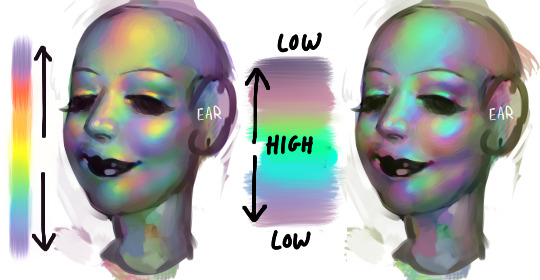
you dont have to use yellow though, i just reckon its the easiest jumping off point. below i just changed the hue in photoshop n got cyan. it still looks like its got depth and all that but now are colours are limited, we missing yellow and orange. try different shit out though. pink is nice too
these are like fairly bad pics but below are some ways to do this with yellow as the colour of your high point/bits where the most light is bouncing off
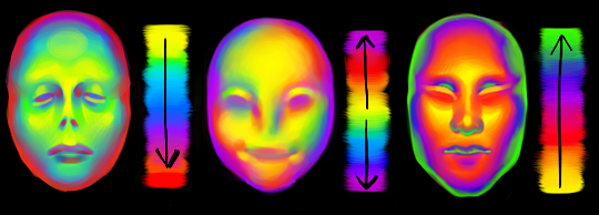
think of the arrow going from the highest to lowest points. i like doing it the way i have in the middle pic cos i reckon its a bit more fun and dynamic. but yeah dont limit yourself to yellow! plenty of other colours out there in the big wide world. and dont worry if it looks garish you can always edit it later on
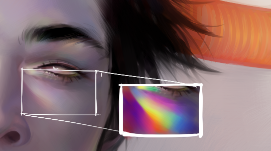
anyway you dont have to think too long and hard about like colour order or anything though. the main thing is just putting the right colours next to one another, so if youve got a green patch and a red patch blend them together with some yellow, orange/red goes between yellow and purple, etc etc
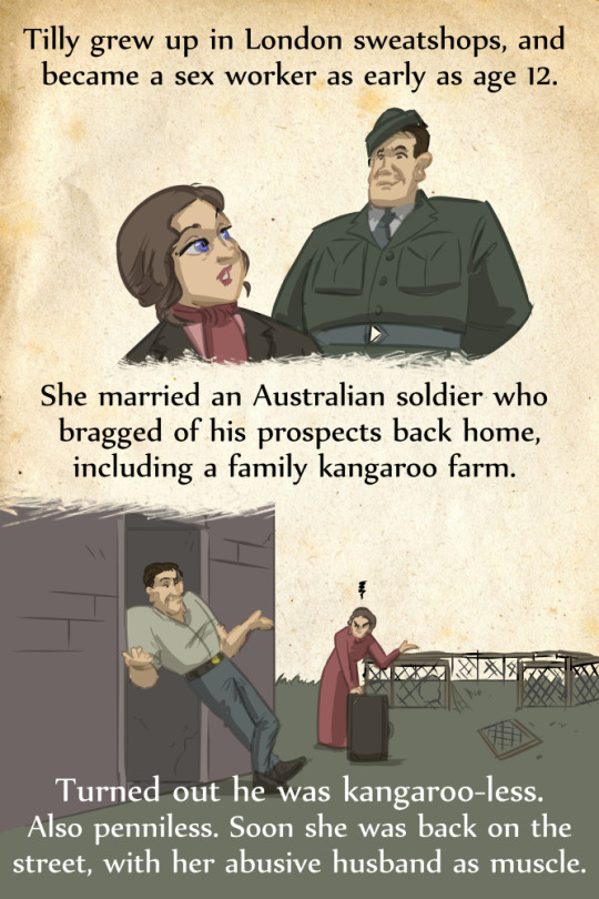
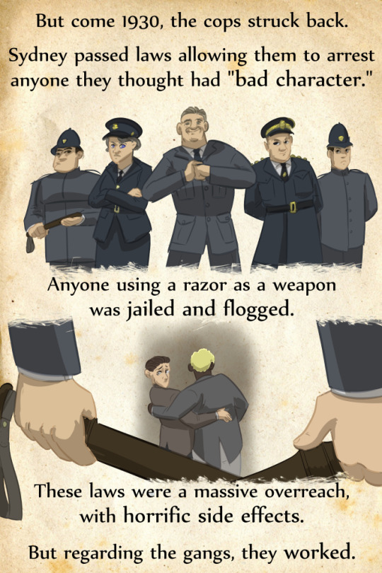
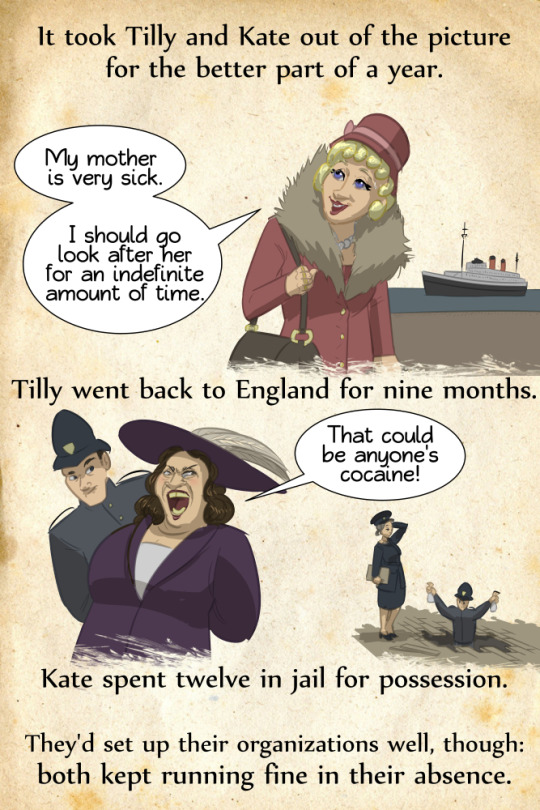
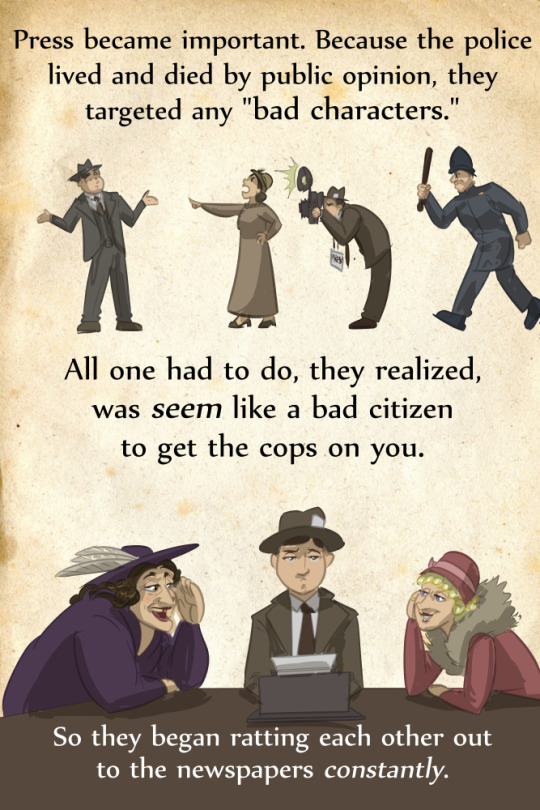
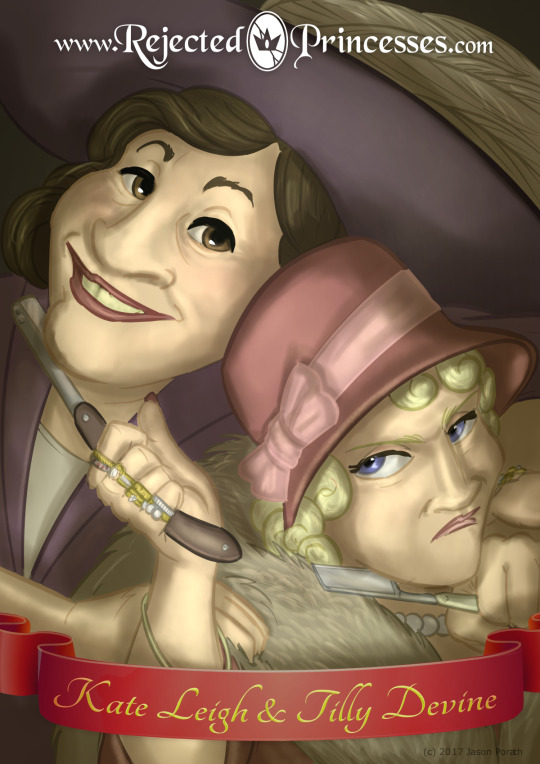
OH MY GOD, THIS IS AMAZING. (I spent the better part of one year reading about the razor gangs of Sydney, and stole a whole lot of Sydney true crime for one of my LoK fics.)
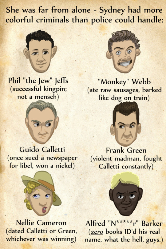
(I’m especially impressed that OP has turned up the given name of “N****r” Barker, which wasn’t in any known records last I checked.)
The artist mentions Underbelly: Razor, the trashy TV mini-series based on the lives of Kate and Tilly – it’s absolutely TERRIGREAT, and I recommend it to anyone who adored Miss Fisher’s Murder Mysteries but thought it needed more topless sex worker brawls.
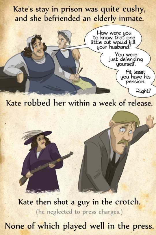
(An actual thing that happened in actual history, btw.)
A fictionalised melding of Kate and Tilly appears in Ruth Park’s Harp in the South, and, more recently, in Justine Larbalestier’s Razorhurst, a YA ghost story set in the same area. (Larbalestier gets bonus points for making the fictionalised Barker a major character, whose nickname isn’t a slur.)
“One kingpin sucker-punched the other by jumping from a tram” may be the most Australian crime story I’ve ever heard.
These images are from a rare type specimen housed in Columbia University’s Butler Library.
Printed in 1874 by William H. Page & Co. The Specimens of Chromatic Wood Type, Borders, Etc. contains over 100 pages of the most colourful, eye-popping type. These excellent photos are by Becca Hirsbrunner.
“Chromatic” typefaces are designed so that each character has separate layers that are intended to be typeset in alignment and printed in different colours. Many of the designs above overlap each other creating a third colour.
This specimen book was used to sell the woodtype to printers. The type is said to have cost around 25 cents per letter, per colour layer, certainly not cheap back then.
From the introduction to Specimens of Chromatic Wood Type, 1874:
To Color Printers We have the pleasure of laying before you a Specimen Book of Chromatic Wood Type, and would say it is now eighteen years since we began Type making. Progress in the Art can be seen by comparing the present volume, with Specimens of that date. There were at that time five or six other manufacturers in the country. Now we manufacture seven-eights of all the Wood Type made, and are now able to show by itself a Book of Chromatic Type and Borders that is not excelled in the world. It has taken years of time to prepare and perfect it. The designs with two or three exceptions are entirely original with us. The demand for Chromatic Type is quite limited, therefore we cannot apply this book free, only to our Agents. Most Respectfully Yours, Wm. H. Page & Co.
There are many modern versions of chromatic type, including Terrance Weinzierl’s award winning Pizza Press face.
We were just stunned by the beauty of this chromatic wood type posted by @typeworship on New Year’s Day, and the links provided offer page after page of eye-popping chromatic type. As a type nerd, it was a wonderful way to spend an hour on the first day of 2017.
William H. Page & Co. of Norwich, Connecticut, was founded by Page in 1859 (which was preceded three years earlier by his type manufacturing company Page & Bassett), and dominated wood type production in the U. S. until the 1880s, when it was seriously challenged by our own Hamilton Manufacturing Company in Two Rivers, Wisconsin. When Page retired in 1891, he sold his stock and equipment to Hamilton, eventually leading Hamilton by 1910 to become the largest manufacturer of wood type in the country. The Hamilton Company finally ceased production of wood type in the 1980s, but today the Hamilton Wood Type & Printing Museum in Two Rivers preserves the heritage of wood type manufacturing in the U. S. and continues to develop new fonts of type.
All new Tuesday Tips this year!
Today, why I call the Almost Profile. Gives a slight more sense of volume. Useful in a lot of situation. Try it out!
-Norm
#tuesdaytips #almostprofile #100tuesdaytips2
#grizandnorm #grizandnormtuesdaytips #happynewyears2017