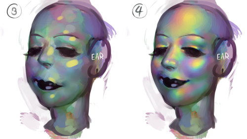
sorry im not quite sure what you mean but im assuming youre talking about the rainbow shit
i dont know all the art terms so bear with me
to add to this post, i start by just putting some random colours down then blending them out. for trolls i use lots of green blue and purple cos i guess my ocular cones n rods tell me cool colours are closer to grey than warm ones are
then i pick a colour for the high points and blend out with adjacent colours to get that rainbow effect
yellow is a good colour cos you can blend from yellow to red or yellow to blue and it will look nice + allow you to include lots of different colours which adds to the holographic/iridescent/whatever effect and still give an impression of depth without having to add heaps of black and muddying up the colours
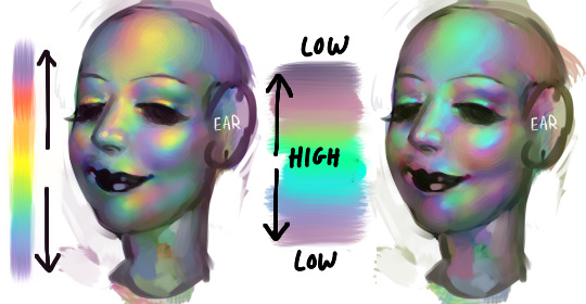
you dont have to use yellow though, i just reckon its the easiest jumping off point. below i just changed the hue in photoshop n got cyan. it still looks like its got depth and all that but now are colours are limited, we missing yellow and orange. try different shit out though. pink is nice too
these are like fairly bad pics but below are some ways to do this with yellow as the colour of your high point/bits where the most light is bouncing off
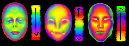
think of the arrow going from the highest to lowest points. i like doing it the way i have in the middle pic cos i reckon its a bit more fun and dynamic. but yeah dont limit yourself to yellow! plenty of other colours out there in the big wide world. and dont worry if it looks garish you can always edit it later on
anyway you dont have to think too long and hard about like colour order or anything though. the main thing is just putting the right colours next to one another, so if youve got a green patch and a red patch blend them together with some yellow, orange/red goes between yellow and purple, etc etc
Hey folks, Paul here for TUTOR TUESDAY! If you missed Part 1 last week, be sure to click here and check it out.
I’m looking forward to Meg’s return to the blog next week, and I bet a lot of her fans are, too! Be sure to message if you have requests, and thanks for checking in. Have a good one!
I got this sweet message with some very real questions about color! Here is where I try to answer:
Looking at the following pieces, you’ll notice (at the core) it’s an interplay between warm/cool, complimentary colors, or primary colors. Here’s that in order:
But of course there’s a lot more happening than these fundamentals. At least, that’s what it looks like. But really I’m just repeating the same principles of warm/cool, complimentary, and primary colors
(color theory)
in smaller, more hushed ways throughout the whole painting! This makes it harmonious, but interesting! Let me explain and show through deconstruction:
1. Basic division of primary colors:
2. Smaller divisions of primary colors:
3. Smaller divisions of primary-color-relationships (it just keeps happening):
At the core, we are repeating the same core principle of contrasting primary colors, but with varying degrees of contrast and subtlety as we add more detail.
Indulging in the midtones:
Everyone’s all about those highlights and shadows, but great color treats the midtones just as lovingly. In this piece, you’ll notice bits of what seems to be blues/purples within all the green foliage:
Really, if you color-dropped them, it is just grey. The simplest way to tap into these greys is to just move your color pick to the left and a few degrees towards it’s complimentary color. Now dapple it all over the leaves and rocks and forms! See what it does to your piece.
Midtones aren’t as explicit, but they are certainly felt. It can differentiate mature color to immature color, goodness to greatness, etc. Do allow yourself permission to camp out here longer!
Final:
There’ a whole other half to color that says, “Well, why did you choose to make the sky teal with yellow? Why is the sunset purple this time, etc?” This is all your feelings, your intuitions, your personality, your intention, etc. It really is the large majority of why you choose a color.
It is just as important as the technical stuff, but I can’t really teach you to have a certain taste. I can just urge you to not neglect this part about color (all the FEELS) because otherwise things will turn out hollow. Allow yourself permission to care about the feelings and the technical stuff, don’t shame one over the other, and appreciate the growth in both.
I can only encourage you to keep actualizing your tastes and personality through your art. Repeatedly. This will become more clear and refined for you, and I’m sure you will notice it growing with you as well.
Thanks again for your sweetness and forcing me to reflect and come to my own thoughts about color!
Here are some other resources that say things in a way better than I could: