Tuesday Tips – The Mask Helps to figure out the shape of eyes in perspective by thinking of its surrounding area instead of guessing it. -Norm #tuesdaytips #100tuesdaytips #grizandnorm #themask #drawingtutorial #drawingtips #arttutorial
A compilation of stuff I know about drawing Asian faces and Asian culture! I feel like many “How-To-Draw” tutorials often default to European faces and are not really helpful when drawing people of other races. So I thought I’d put this together in case anyone is interested! Feel free to share this guide and shoot me questions if you have any! I’m by no means an expert, I just know a few things from drawing experience and from my own cultural background.
sorry im not quite sure what you mean but im assuming youre talking about the rainbow shit
i dont know all the art terms so bear with me
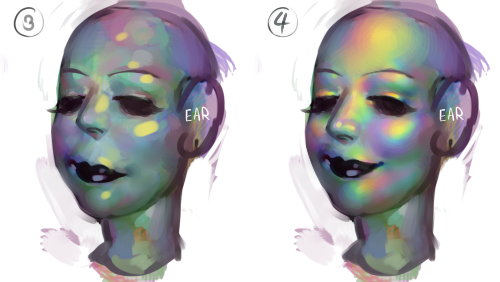
to add to this post, i start by just putting some random colours down then blending them out. for trolls i use lots of green blue and purple cos i guess my ocular cones n rods tell me cool colours are closer to grey than warm ones are
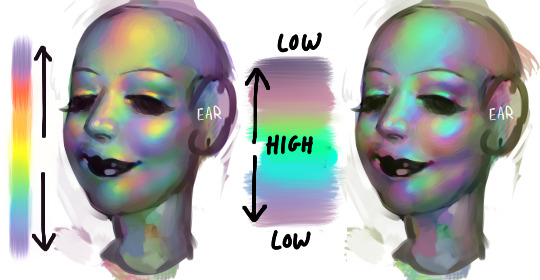
then i pick a colour for the high points and blend out with adjacent colours to get that rainbow effect
yellow is a good colour cos you can blend from yellow to red or yellow to blue and it will look nice + allow you to include lots of different colours which adds to the holographic/iridescent/whatever effect and still give an impression of depth without having to add heaps of black and muddying up the colours
you dont have to use yellow though, i just reckon its the easiest jumping off point. below i just changed the hue in photoshop n got cyan. it still looks like its got depth and all that but now are colours are limited, we missing yellow and orange. try different shit out though. pink is nice too
these are like fairly bad pics but below are some ways to do this with yellow as the colour of your high point/bits where the most light is bouncing off
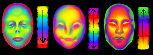
think of the arrow going from the highest to lowest points. i like doing it the way i have in the middle pic cos i reckon its a bit more fun and dynamic. but yeah dont limit yourself to yellow! plenty of other colours out there in the big wide world. and dont worry if it looks garish you can always edit it later on
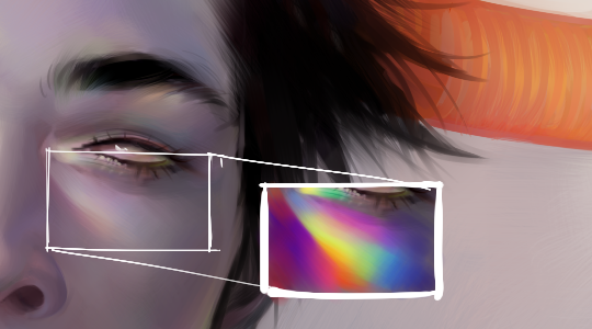
anyway you dont have to think too long and hard about like colour order or anything though. the main thing is just putting the right colours next to one another, so if youve got a green patch and a red patch blend them together with some yellow, orange/red goes between yellow and purple, etc etc
The British Hairdressing Awards, sponsored by Schwarzkopf Professional, celebrates the very best of British hairdressing – recognising and rewarding the creative talents of individuals and teams who make this industry one of which we can all be proud. #Love it!